|
Close window
HELP
How do I ... ?
Navigate this report
The content in this report can be accessed at any time using the left-hand navigation bar. Use the navigation bar to do the following:
- Select a report for a subject area;
- Choose results for the nation, for states, or for student groups;
- View sample questions.
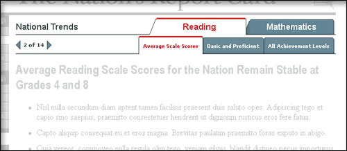
Once you have chosen to view a report card, you can use the arrows in the upper-left hand corner to move through a report page by page. Also, you can switch back and forth between subjects by using the highest level of tabs across the top of the page. By using the secondary level of tabs across the top of the page, you can jump to specific information as indicated.
Take a look! Move the mouse pointer over this image
to explore report card navigation.
Use tabs
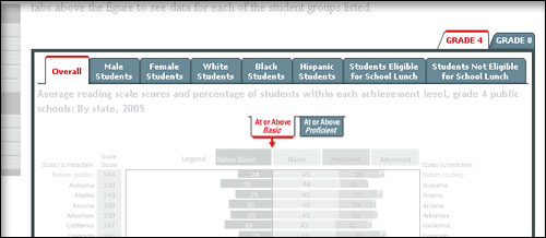
When you see tabs at the upper right of a page or chart, you can click on a tab to get an alternate subject, grade, or view. For instance, in the image below you can choose data for grade 4 or grade 8. When you are viewing a page of a report card, you can choose grade-level graphics, graphics showing scale score or achievement-level results, or graphical views by student groups (where available).
Try it! Move the mouse pointer over this image
to explore how to use tabs.
Use interactive maps
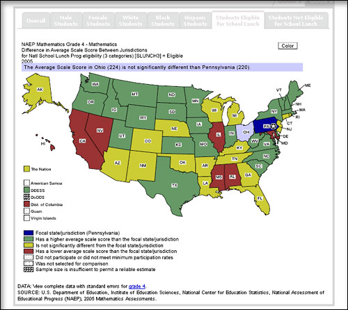
The interactive maps allow you to compare results for a particular state to the results for the nation or another state. Roll your mouse over a state to learn its average score or the percentage of students performing at an achievement level. By clicking on the map, you can select a focal jurisdiction. Then you can compare the average score or percentage of the focal state to that in other states. You can also use the tabs above the map to choose a focus on one of the student groups listed.
Note: You will need to have the Adobe® SVG (Scalable Vector Graphics) viewer installed on your computer to view the interactive state maps.
Try it! Move the mouse pointer over this static map
to learn how to see specific data on an SVG map.
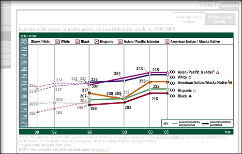
Use interactive line charts
Several line charts showing the performance trends of student groups have overlapping lines. So you can focus on a specific group, the graphics on this website use Macromedia® Flash (requires a free Flash player), allowing you to show or hide data for various groups. For instance, if you are looking at the race/ethnicity figure on a page of a report card, you can click on a box above the graphic to remove a student group. You may remove more than one. Click on the box again and the data for that group will reappear.
Try it! Move the mouse pointer over this image
to learn more about interactive charts.
Print a page
Use the "Print This Page" link at the bottom of each page for a printer-friendly view of the page. Note that all the interactive features of the graphics are maintained in the "Print This Page" view.
Download recommended Flash Player and SVG Viewer
Flash
 The NAEP website presents certain material in the form of Flash animations. In order to view these animations, you will need to install a Adobe Flash Player, version 7 or higher. Refer to Adobe's Flash support center for assistance in working with the Flash Player. The NAEP website presents certain material in the form of Flash animations. In order to view these animations, you will need to install a Adobe Flash Player, version 7 or higher. Refer to Adobe's Flash support center for assistance in working with the Flash Player.
Scalable Vector Graphics
 Scalable Vector Graphics (SVG) is a W3C recommendation (web standard) for a graphics file format and web development language based on XML. Through the use of SVG, NAEP is able to offer dynamically generated, high-quality, scalable, interactive graphics from real-time data. Although many SVG viewers are available, NAEP recommends the Adobe SVG Viewer 3.0 (or above) as a stable, well-supported viewer. Visit Adobe's SVG Page for more information and to download a free viewer. Scalable Vector Graphics (SVG) is a W3C recommendation (web standard) for a graphics file format and web development language based on XML. Through the use of SVG, NAEP is able to offer dynamically generated, high-quality, scalable, interactive graphics from real-time data. Although many SVG viewers are available, NAEP recommends the Adobe SVG Viewer 3.0 (or above) as a stable, well-supported viewer. Visit Adobe's SVG Page for more information and to download a free viewer.
Webmaster's note: As of September 29, 2004, Adobe has identified several known problems with Netscape browsers which may prevent the SVG viewer from properly rendering an image. There are no known work arounds at this time. Therefore, if you would like to view SVG graphics, we recommend the latest version of Internet Explorer.
Close window
|